The awkward growth review is the one in which every team has evidence for its own position. Marketing has cut reported CAC. Sales conversion is holding. Marketplace volume is up. Customer Success, however, sees weaker retention among new customers, while Operations and Support are absorbing slower fulfilment and more work.
All of those readings can be correct because they sit at different points in the same commercial chain:
Acquisition → Qualified demand → Conversion → Retention and customer value → Transaction volume → Supply and capacity → Fulfilment and service → Repeat → Economic outcome
A useful growth analysis follows an improvement beyond the dashboard that first reported it. The question is whether the effect still looks favourable when it reaches the next stage that carries economic consequences.
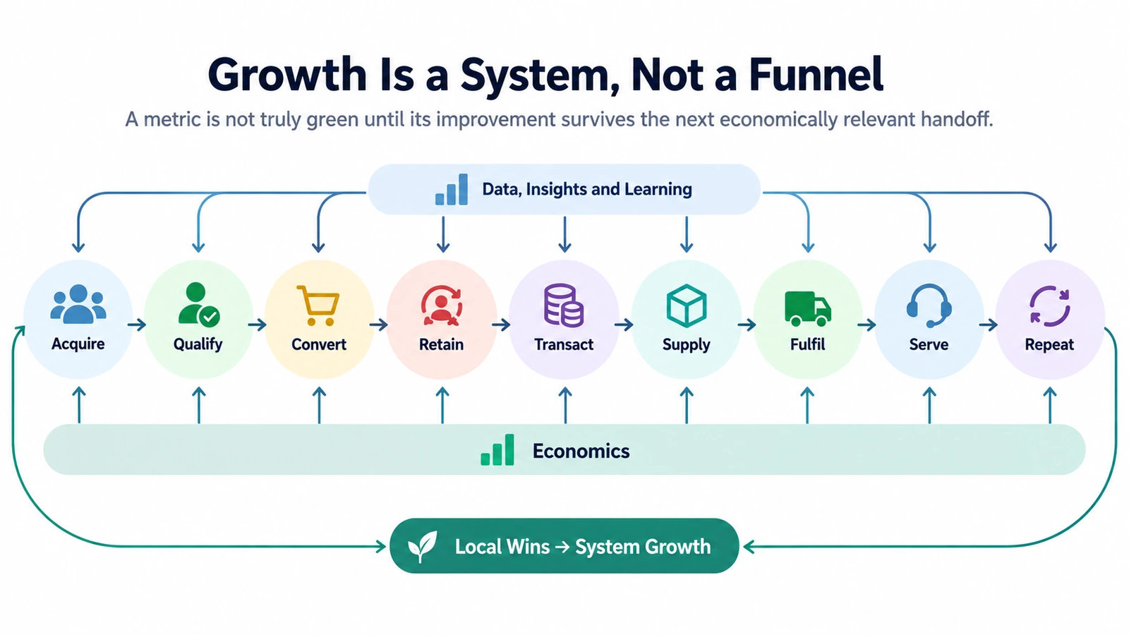
Figure: a local improvement only counts once it survives the next commercially meaningful handoff.
Five dashboards, one business system
Take a hypothetical marketplace that launches a new acquisition channel. Traffic rises quickly, reported CAC falls, and transaction volume continues to grow. Several weeks later, a different pattern appears downstream: fewer visitors qualify as valuable demand, the new-customer cohort retains less well, more orders arrive where supply is already tight, and fulfilment and support start to deteriorate.
The acquisition result has not become false. Its scope has become clearer. A cheaper source of traffic is only one part of the commercial outcome, and the rest of the chain determines how much of that gain the business keeps.
This is why an executive dashboard that simply places five team charts on one page often disappoints. The missing object is the relationship between them. If acquisition quality improves, which measure should respond next? If transaction volume rises, where should monetisation appear? If demand expands, which operating constraint could absorb or erase the gain?
For the marketplace, that gives a practical route through the analysis: acquisition into qualified demand; conversion into cohort value; transaction activity into monetisation; and demand into supply, fulfilment and service economics.
Before comparing dashboards, define the measurement contract
Start with a deliberately simple example. CAC moves from 100 to 80. If the earlier denominator was new paying customers and the later denominator is new registered accounts, the figures are arithmetically sound and commercially incomparable. The same problem appears when one team counts only paid-media spend while another includes sales commissions, tools, creative production and promotions. ScaleXP’s CAC guide illustrates why the included cost base needs to be explicit.
Before interpreting movement, fix eight fields around the metric: commercial stage; economic unit; numerator; eligible denominator; grain and dimensions; time window or cohort; attribution rule; and cost boundary. A user-level metric and an order-level metric may share a label while answering different questions.
This check also catches quieter definition drift. A conversion rate based on all leads does not measure the same population as one based only on sales-qualified leads. If the population changes, repair the comparison before debating performance.
Acquisition: separate attribution from incremental demand
An attributed conversion tells you where a reporting rule assigned an outcome. Incrementality asks whether the outcome would have happened without the intervention. Google Ads describes Conversion Lift as a treatment-and-control experiment for estimating the causal impact of advertising, which is why it answers a different question from ordinary attribution reporting. Google Ads Help
For the business review, the distinction changes what has to be checked after a channel looks good. Attractive attributed ROAS and rising traffic still leave open the quality of the demand, the retention of the resulting customers, the geographies or categories into which that demand flows, and the economics after promotions, returns, fulfilment and support are included.
That is the useful role of the familiar funnel labels, Traffic, Lead, MQL, SQL, Opportunity and Order. Each stage can filter quality rather than merely produce another conversion percentage.
In the marketplace example, the new channel delivers more traffic and lower reported CAC while qualified-demand rate falls. The evidence supports a narrower statement than ‘acquisition improved’: front-end attention became cheaper. The value of the extra demand remains unresolved at this point in the chain.
Conversion only tells part of the cohort story
Suppose the same channel lifts conversion from 8% to 10%. That movement matters, but the customers who make up the 10% need to be followed after the sale. Customer-lifetime-value research treats acquisition, retention, profitability and customer heterogeneity as linked modelling problems; Gupta and co-authors’ review of CLV models explains why materially different customer groups can have different retention and value characteristics. Gupta et al., Modeling Customer Lifetime Value
A cohort cut can overturn the comfort of the aggregate without contradicting it:
| Headline result | What a cohort view might reveal |
|---|---|
| Conversion ↑ | A new channel converts better, but first-month refunds are also higher |
| Retention flat | Existing customers improve while new customers deteriorate, cancelling each other out |
| ARPU ↑ | A small high-value segment lifts the average while most cohorts do not improve |
| CAC ↓ | Acquisition is cheaper, but a larger share of customers comes from low-value cohorts |
The appropriate cut depends on the mechanism. Acquisition channel, segment, geography or category may separate groups whose economics behave differently; adding more company-wide averages usually does not.
Our marketplace now has that evidence. Conversion has not collapsed, yet the new-customer cohort retains less well. The 8% to 10% improvement is still there, but it no longer describes the whole customer outcome.
Bridge transaction volume to monetisation and contribution
GMV, GOV and GBV can all be useful measures of marketplace activity. A marketplace can facilitate much more activity without recognising the same amount as revenue. Airbnb’s 2020 Form 10-K, for example, defines Gross Booking Value broadly enough to include amounts economically belonging to hosts and taxing authorities as well as service-related amounts. GBV therefore covers considerably more than Airbnb’s recognised revenue. Airbnb 2020 Form 10-K
That creates a sequence to reconcile: Gross volume → Fee base → Take rate / fee architecture → Recognised revenue → Variable cost → Contribution economics. eBay’s 2024 Form 10-K defines take rate using net revenues relative to GMV, making the denominator explicit. eBay 2024 Form 10-K Any comparison still depends on consistent periods, currency treatment, cancellation and refund handling, and transaction populations.
Nor does one percentage necessarily describe the fee architecture. Amazon seller pricing combines subscription plans, category-based referral fees and other charges. Amazon Seller Pricing A sentence such as ‘the platform takes 15%’ can therefore compress several monetisation mechanisms into one number.
The example marketplace still has rising transaction volume. At this stage the analyst has to reconcile that activity with recognised revenue and then with the contribution left after serving the transactions. Volume remains a useful signal, but it is no longer allowed to stand in for the economic result.
When demand outruns supply, the pressure appears downstream
The new channel in our example sends a disproportionate share of demand into cities and time periods that were already constrained. Orders can keep rising while fulfilment slows and support demand increases. This is the point where a growth review has to inspect the shape of demand, not just its size.
A constraint check asks where the growth landed, whether enough seller, driver, inventory or other capacity exists there, whether regional or time-window imbalance is worsening, and whether fulfilment time, cancellations, refunds, rework, support contact rate or handling load are moving with it. Extra subsidy, labour or operating cost used to hold service quality constant belongs in the same review.
There is no universal congestion threshold to import. Research on platform competition describes mechanisms in which additional users can intensify congestion and reduce service quality, but it does not supply one numeric boundary for every marketplace. Journal of Economic Interaction and Coordination
The cost view needs to preserve similar distinctions. Contribution analysis separates cost layers that behave differently; OpenStax’s overview of contribution margin and contribution-format income statements provides the basic accounting structure. OpenStax, Principles of Managerial Accounting
One business might split the path into transaction-variable cost → fulfilment / service cost → customer- or channel-avoidable cost → shared fixed cost. That sequence is illustrative rather than universal. Its value is simply to stop downstream service cost disappearing inside a broad margin line.
By now the apparently conflicting dashboards are easy to place. Marketing has cheaper acquisition. Marketplace has more volume. Operations has a capacity problem. Support has more load. The analysis can proceed without declaring any of those teams wrong.
Reconcile the whole chain: did the improvement survive each handoff?
A repeatable review can be run as seven checks, but they do not need seven separate dashboards.
| Check | What to establish |
|---|---|
| 1. Metric contract | Formula, numerator, denominator, grain, cohort, time window, attribution and cost boundary are stable enough for comparison. |
| 2. Stage | The metric is placed at acquisition, qualification, conversion, retention, transaction volume, supply, fulfilment or economics. |
| 3. Next handoff | The next commercially relevant outcome that should respond is named in advance. |
| 4. Cohort and mix | New versus existing customers, channels, geographies, categories or supply structures are separated where their behaviour differs. |
| 5. Volume to economics | Traffic, orders, GMV, take rate, revenue and cost are reconciled rather than treated as one layer. |
| 6. Supply and service | Fulfilment time, cancellations, support burden, subsidy or other capacity signals show whether demand remains serviceable. |
| 7. Classification | The gain stays a local win until downstream evidence supports calling it a system-level growth win. |
Applied to the opening marketplace, the cheaper acquisition was real and the extra transaction activity was real. What failed to keep pace was demand quality, cohort value and the ability of supply and service operations to absorb the new mix. The business therefore improved less than the acquisition dashboard implied.
One judgement rule is enough to carry into the next review:
A metric is not truly green until its improvement survives the next economically relevant handoff.
References
- Google Ads Help, About Conversion Lift
- ScaleXP, Customer Acquisition Costs
- Gupta et al., Modeling Customer Lifetime Value
- Airbnb, 2020 Form 10-K
- eBay, 2024 Form 10-K
- Amazon Seller Services, Pricing
- Journal of Economic Interaction and Coordination, Congestion, network effects and platform competition
- OpenStax, Principles of Managerial Accounting, Chapter 3 Summary