A red KPI cell can represent more than one kind of problem.
Take weekly order-fulfilment cycle time, measured in hours with lower values preferred. Management has set a Target of 48 hours or less. The latest week comes in at 54 hours, so the dashboard is right to flag a miss. What that result does not tell us yet is whether the process changed this week, whether a predefined response has been triggered, or whether the underlying metric is still comparable with earlier weeks.
Those questions belong to different controls. Target describes the performance the organisation wants. Threshold connects a measured value to an agreed action. Control Limits use a suitable historical baseline to test whether current process behaviour still resembles the established pattern. Before using any of them, the series itself has to be stable enough to compare.
First make the series comparable
Order-fulfilment cycle time can change meaning without changing its label. One team may start the clock at order creation; another at payment confirmation, warehouse acceptance or release from fraud review. The end event can be dispatch, carrier hand-off or customer delivery. Exclusions, time zones, late records and population rules can move the reported number even when the physical operation has not changed.
Metric governance is meant to keep those choices visible. dbt’s MetricFlow and Semantic Layer centralise reusable metric logic, while dbt’s metric properties can describe items such as calculation method, expression, time grain, dimensions and filters. They are examples rather than a universal checklist, but they illustrate the same requirement: the definition and version need to be reproducible if a time-series comparison is going to mean anything.
For the worked example below, assume the start event, end event, weekly grain, eligible orders, data source and metric version stay fixed. If the series moves from 55 hours to 42 at the same time as one of those definitions changes, comparability has to be restored before the movement is interpreted.
The target can sit below the process centre
The Target here is ≤ 48 hours. Management may choose that number as an operating commitment or improvement objective even if the existing process has historically centred nearer 55 hours. A forecast, if the team maintains one, would estimate the likely outcome under current assumptions; the Target records the desired outcome.
That gives us a useful distinction. A process can repeat its existing pattern quite consistently and still fail the target week after week. In that situation, the management problem is process capability or design, not evidence that an exceptional event appeared in one particular week.
Goal-setting research does not remove the need for that distinction. Locke and Latham’s review found that specific, challenging goals can improve performance under appropriate conditions, with commitment, feedback, ability and task complexity among the factors that affect results. Locke & Latham, 2002 Poorly governed targets can also distort behaviour; Goals Gone Wild discusses several failure modes.
For this KPI, the target answers the performance question: are we at or below 48 hours? It says nothing on its own about how unusual this week’s observation is relative to the process history.
The threshold belongs to an operating response
Now suppose the team also agrees an Action Threshold of ≥ 60 hours. Crossing 60 requires the operations owner to run a service-risk review covering backlog, capacity, logistics and customer impact.
The value matters because a response has been attached to it. The same design could use several severities, with different owners, windows or actions. Google’s SRE Workbook shows this explicitly in Alerting on SLOs, where different burn rates and time windows can lead to pages or tickets, and multiwindow confirmation can reduce some false positives caused by short-lived spikes.
Those SRE numbers are not defaults for a business KPI. What transfers is the operating relationship between a threshold and the decision it triggers.
A team may therefore decide to act at a value that is still statistically ordinary for the historical process. Contract exposure, customer experience or the cost of waiting may justify that policy.
Control limits come from process history
Control Limits use a different source of authority. Under a suitable monitoring method, they are derived from process data and used to judge whether current observations remain consistent with the established variation pattern.
NIST’s Variables Control Charts discusses control limits in the context of statistical control and explicitly separates them from specification limits. The NIST glossary similarly treats observations beyond control limits as evidence that special causes may be affecting the process.
That evidence calls for investigation. It does not identify the root cause, and it does not turn every crossing into a bad business outcome. A point can also remain inside the limits while performance is plainly below management’s target.
For the hypothetical below, assume there is a suitable stable baseline centred near 55 hours, producing an illustrative Control Band of 44 to 66 hours. These values are teaching numbers only. They are not a reusable three-sigma recipe and do not imply that every business KPI belongs on a classical control chart.
Read the same three weeks through all three controls
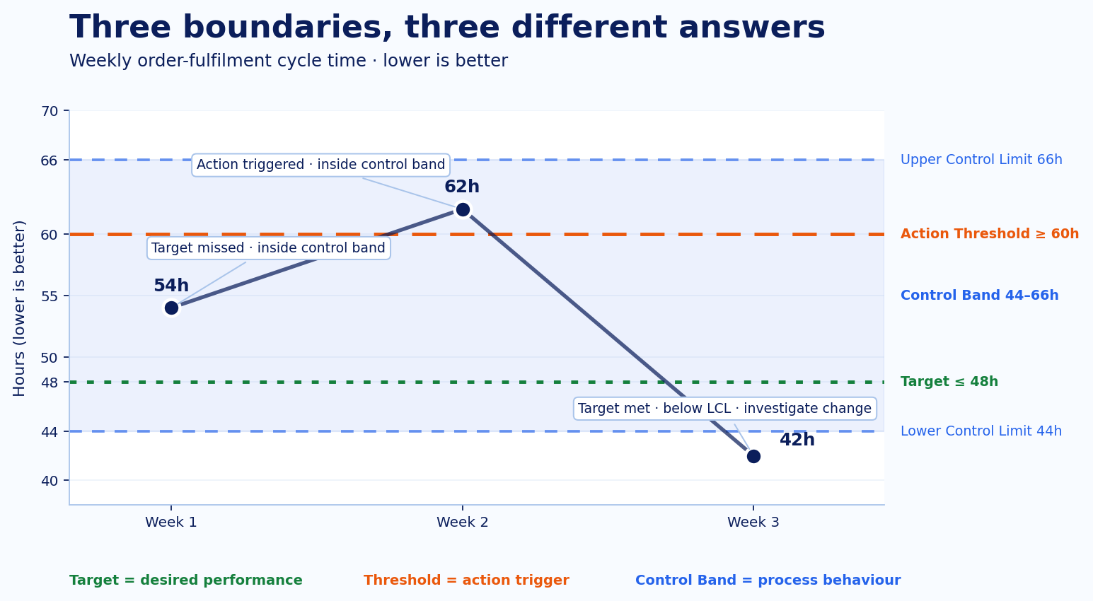
At 54 hours, management has missed the 48-hour Target. The 60-hour Action Threshold has not fired, and 54 remains inside the illustrative 44–66 hour Control Band. If the process has operated around 55 hours for a long time, this week may be entirely consistent with the existing process. The performance gap is still real. The organisation may need to improve the process itself rather than search for a one-off special cause that the data has not shown.
The next week comes in at 62 hours. The 48-hour target is still missed, and the agreed service-risk review now starts because 62 crosses the Action Threshold. The same point is nevertheless still inside the illustrative Control Band. The team acts because its policy says the cost or risk at 60 hours deserves attention; this single observation has not crossed the statistical boundary assumed for the example.
Then the series drops to 42 hours. The headline now looks excellent: 42 is comfortably below the Target and nowhere near the adverse Action Threshold. It is also below the illustrative Lower Control Limit of 44 hours. If the baseline and monitoring method are valid, that change deserves investigation because it is unusual relative to the established process pattern.
There are several possible explanations already inside the scope of this example. A real process improvement may have taken hold. The order mix or eligible population may have changed. Records may be arriving differently. The metric definition may have shifted. Another special cause may be present. The control-limit signal does not tell us which explanation is correct, so 42 hours should not be labelled either a failure or a durable new normal before the change is understood.
Statistical monitoring needs a defensible baseline
The worked example assumes more than most dashboards show. It assumes enough observations to establish a useful baseline and a statistical method that fits the structure of the series.
Many business KPIs are awkward candidates. They may be quarterly, strongly seasonal, trended, highly autocorrelated, or based on populations that change as the product and customer mix evolve. A source-system or metric-definition change can create another break. Classical limits drawn across those conditions can look precise while providing a weak interpretation of what “out of control” means.
NIST’s control-chart guidance depends on the process and data conditions being suitable for monitoring. It also cautions against mechanically recalculating limits simply because another observation has arrived. Baseline choice, stability and regime changes all affect the result.
A fixed red-amber-green rule has a different purpose. “Amber above 55, red above 60” can be a sensible action policy, but it should not acquire statistical meaning by accident. Ignoring time windows, base rates, seasonality or persistence can produce noisy alerts. Google’s use of multiple alerting windows in SRE is one bounded example of designing around transient noise.
If classical control-chart assumptions do not fit, the target and threshold can still remain useful. The process-change question simply needs a monitoring method that matches the data.
Use the checks in this order
When the dashboard changes colour, the operating sequence is straightforward:
- Definition: confirm the population, calculation, time grain, data source and metric version are still comparable.
- Target: decide whether current performance meets the level management wants.
- Threshold: check whether an agreed action rule has fired and who owns the response.
- Statistical monitoring: using an appropriate method, assess whether the time series provides evidence that process behaviour changed.
- Investigation: if there is a signal, determine the cause rather than treating the signal as the cause.
The same sequence gives different answers at 54, 62 and 42 hours, which is exactly what an operator needs. A dashboard can flag the measurement; the next action depends on which of those questions changed state.
References
- dbt Labs: About MetricFlow
- dbt Labs: dbt Semantic Layer
- dbt Labs: Metric properties
- Locke & Latham (2002): Building a Practically Useful Theory of Goal Setting and Task Motivation
- Harvard Business School: Goals Gone Wild
- Google SRE Workbook: Alerting on SLOs
- NIST/SEMATECH: Variables Control Charts
- NIST/SEMATECH: Glossary